Off the blocks: sprinting with the municipality of Utrecht
Posted on 26/01/2021 by Peter Tessel.
2021 started well with a design-and-develop sprint with the municipality of Utrecht. In just one week, we added video as a new feature to U-reka, the search application that was launched last year and that supports the city councillors of Utrecht in their work. Here's our story!
City councillors make municipal policies, a complex and creative process. They determine which problems should be addressed, make policy proposals to solve these problems, debate and adjust their proposals in the council, turn them into policies and monitor how their policies are implemented by the College of Mayor and Alderpersons. This entire process is recorded in all kinds of documents: proposals, policy documents, letters, reports, minutes, motions, amendments, etc. U-reka helps city councillors and their staff to navigate this vast amount of documents. Last week we added video recordings of council meetings to the list.
Since we were not entirely sure how users would want to access the videos, we decided to investigate this together with the information specialists of the municipality, Jade and Marijn. Appropriate given the focus on video, this has been the very first time that we held a sprint without meeting in person! You probably recognize that it is difficult to reproduce all live interactions properly online, but it is still impressive how much you can achieve together in this way. Inspired by GV's design sprint, we decided to pick a single week and meet daily, for a maximum of 2 hours at a time, and to additionally collaborate in other ways.
Monday: information needs
We started with interviewing experts from the municipal clerk's office, city councillors and their staff. We wanted to determine why city councillors review video recordings and what additional information they look up. We found that video review serves three different goals. The first and most important purpose of video review is to augment the factual information captured in the (textual) minutes with an impression of the signals conveyed affectively, non-verbally, implicitly. In other words, to understand how things proceeded during the meeting: the way an alderperson made a commitment, a fellow councillor advocated a proposal, a colleague responded when her/his motion was rejected, etc. Whether something was said casually, with great enthusiasm or as a joke is important knowledge for drawing up the list of discussion points while trying to forge a coalition with other parties, to give a concrete example. The second use of video recordings is to determine what someone said exactly; for example to check statements of city councillors (not least their own) for consistency and written commitments of alderpersons for accuracy. Users do not always rely on the written minutes for this, since note takers cannot always avoid giving their own interpretation to what was said. Finally, if users want to revisit the proceedings of the discussion at the meeting right after it took place, only the video itself is available for reference. Minutes have to be worked out, a labor-intensive task that takes time.
Tuesday: knowledge graph
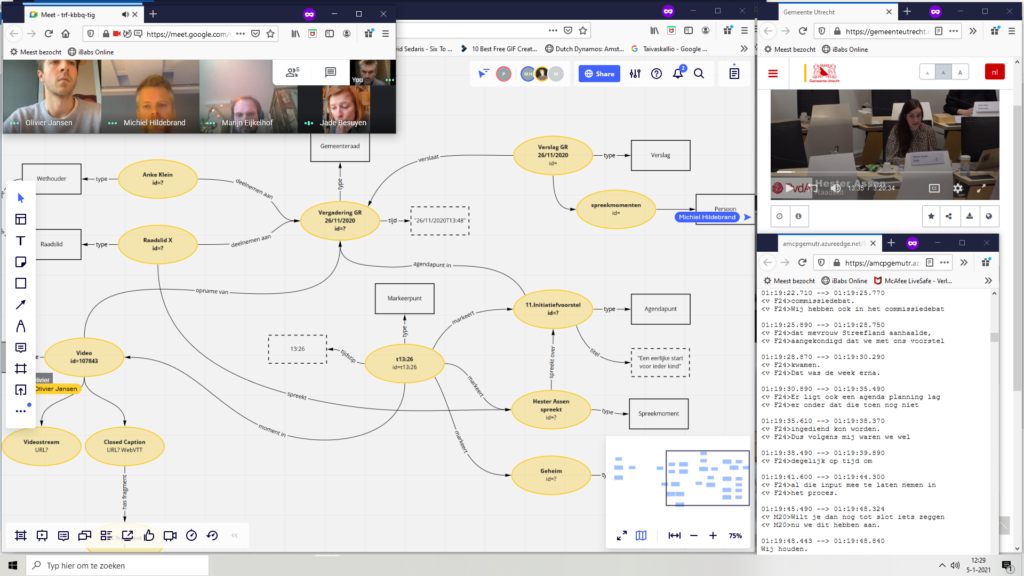
The second day started with a discussion of the information needs identified the day before. We defined three main categories: users want to find fragments in which specific documents are discussed, they want to find fragments about a topic within a specific meeting and they want to find fragments about a topic in the collection of meetings. After Jade and Marijn had prioritized the search tasks, we started modelling the knowledge graph that we would need to be able to access relevant fragments. Based on the list with search tasks and a video recording of a specific meeting we developed a knowledge graph in Miro, an online collaborative whiteboard. This all worked very well: together we produced a very neat sketch of the domain and while doing this we got a good feeling about the quality of the video data and the possibilities and limitations of the new feature.

Wednesday: interface
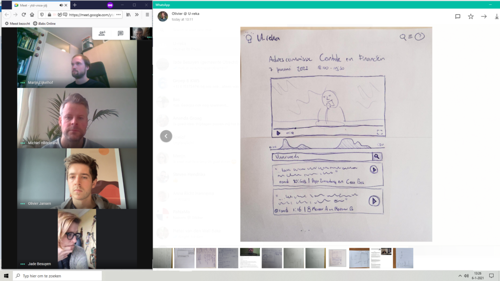
We now switched our focus to the UI/UX for the anticipated tool. We turned off our cameras and microphones and used pencil and paper to individually sketch out our ideas for the two main search tasks we had identified: finding speakers or topics in a selected video and finding them in the whole collection. Once we were done, we made photos of our sketches, shared them and discussed them together. It was interesting to see that Jade, Marijn and Michiel, who had built U-reka, fit their ideas into the existing application, while Olivier and Peter came up with entirely new designs. We finished the day by combining elements of the individual sketches to determine how and where users should be able to access the videos and which entities from the knowledge graph make up a result together.

Thursday: algorithms
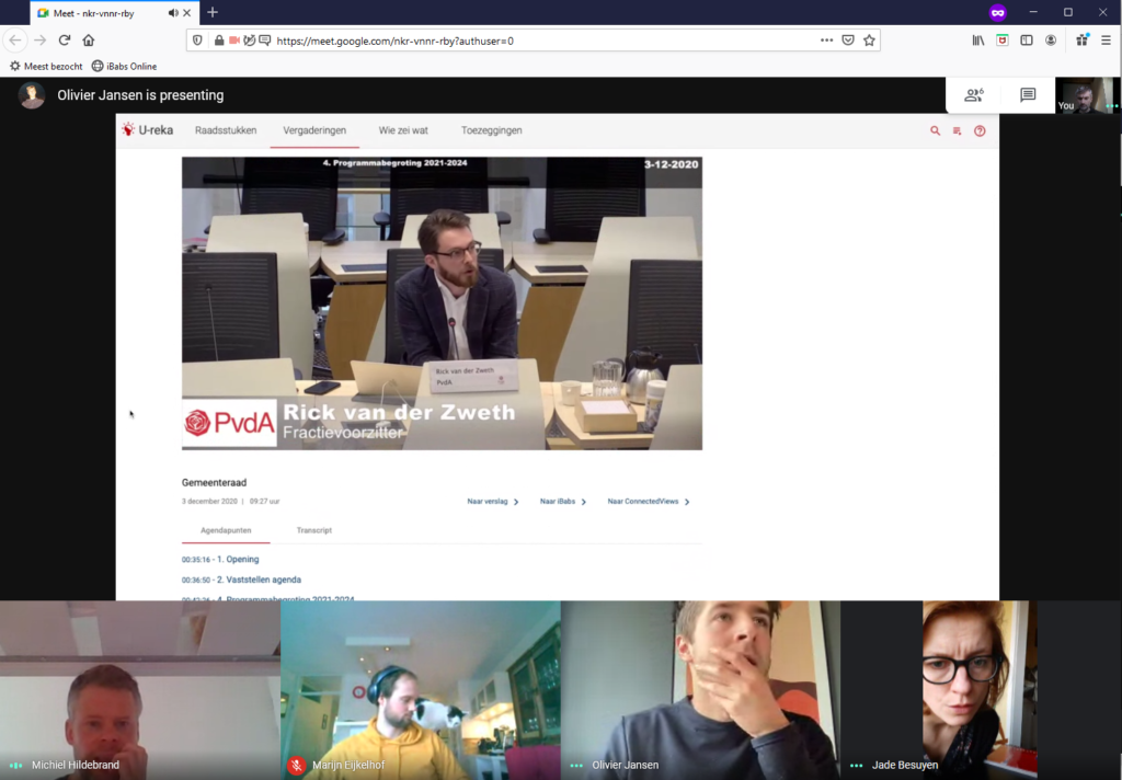
Michiel and Olivier now set out to create prototype functionalities for the search tasks. They had already mapped the video data to the knowledge graph we created on Tuesday and could now use Spinque Desk to sketch the third and final part of the new search functionalities: the search strategies. In other words: they designed the algorithms that select relevant entities from the knowledge graph in response to the search queries that we identified. At the same time, they extended the existing interface of U-reka with new elements: a direct link from existing documents to fragments where they were discussed, a detail page where users can search within a single video, and a new section where users can search in the collection of videos.

Friday: test and implementation
The final day of the sprint, it is time to put the newly created features to the test. Exciting! From the U-Reka development we have become quite familiar with the domain and key players, and we set out to deliver actual functionality and not just a prototype, but our experience is also that you can never anticipate perfectly how functionality works out for the people who will use it. Again, as always, putting the result so far in front of real users gave valuable insights: the new features clearly met a need, but the mode of interaction could be improved further. For example, searching subtitles guides the user to the entry point inside the video where the topic of interest is discussed. However, that discussion does not necessarily start at the moment where a query term is used. Our users could clearly indicate how long before a term is used they would like the video to start. After we made some more adjustments like this to the UX, we implemented these new features and realized the addition of a new and very rich information source for the municipality.

All in all, the design-and-develop sprint with Jade and Marijn has been a great way to start the New Year: develop functionality that you know meets the needs of your users. If you're interested in the result, you can have a look yourself.
P.S.: did you spot the feline muze that inspired us along the way? ;)